Data Visualization Tools
Excel data visualization tools for presentation and reporting
Excel Data Visualization Tools | Rate this solution: (4/5 from 2 votes) |
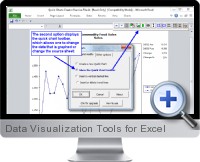
Excel Data Visualization Tools (Charting Collection) adds a tab to the Excel menu with a variety of charts types and options dedicated to data visualization. New chart types to convey information in the most efficient manner as well as value added options for existing charts help to enhance business reporting and analysis. The Excel add-in allows to insert and modify data visualizations in both newly created dashboards and existing reporting solutions.
Charting features of the Excel data visualization tools include:
- Box and whisker plot charting with configurable percentile or statistical threshold limits.
- Bubble chart creation tools with added options for visualization over multiple dimensions.
- Cascade charts can be added and adjusted for comparative analysis such as volume to price per unit rates.
- Charts with combined stacking and clustering can be used to display group analysis over multiple dimensions.
- Dot plots offer an alternative to column charts for faster understanding of trends across unit types.
- Histogram visualization allows multiple histograms to be generated from data tables with range constraint control.
- Area and bar Mekko charting adds an additional dimension to the bar width or area size for advanced visualization of contributions and trends.
- Panel charting tools allow to split time series lines into time segments with independent scaling to quick understand comparison and trends over time.
- Sensitivity tools for charting display breakdown of influential components via tornado or fishbone visualization solutions.
- Waterfall charts help to convey and explain changes in data over time or between dimension units.
- Batch processing tools allow to create many charts from many columns or one chart from summary chart from many rows of data.
- For existing visualizations and charts, tools for missing data points and re-arranging charting points and labels allow for greater flexibility to convey information with reports.
- All visualization tools come with detailed help material and step wizards for fast deployment and configuration.
Try It Get It (Pricing is available on the next page)(Updated on 2026-05-01) |
Additional Excel business solutions are categorized as
Free Excel solutions and the
most popular. Further solutions proposed for specific user requirements can be either found in the
Excel Help Forum.